Packaging Challenge #1 – Designing for a broad audience
Rule One of branding and marketing is ‘know who you’re speaking to’. Whether that’s an advertising campaign, company website or on-pack copy, a clear profile of your brand audience helps to cut through the noise and deliver commercial success.
When designing and developing packaging, usually the first and most important questions revolve technically around the product application and how it’s going to be handled, but then we have to consider:
- Who is this for?
- What do we know about this demographic’s purchase habits?
- How can we reflect what matters to them in our packaging?
In an ideal world, packaging designers have a detailed profile of the audience that currently purchases from the brand, as well as details of the wider market in which that product sits – target consumers not currently purchasing that brand but may in the future.
In the vast majority of cases, this information, in surprisingly detailed metrics, is readily available. However, what do designers do without a detailed profile of a brand audience?
When information on the consumer is incomplete, designers may have to make concessions to appeal to a wider and less focused audience. Additionally, a brand entering a new market or segment may have a less developed idea of who they want to reach. In these cases, packaging designers often need to create packaging that inspires and engages, even without a clear or complete idea of who they are hoping to connect with on the store shelves.
How can printers and brands strip packaging design back to its fundamentals in order to reach a broad or less well-defined audience?
Provide exceptional colour consistency
In aiming to reach a broader audience, packaging designers and printers have a balancing act to play. The packaging design must be general enough to avoid alienating a particular demographic, while effectively conveying brand identity and still standing out on-shelf.
Colour is an invaluable tool for catching the eye, often the first thing that engages with the consumer. Whether intentional or not, colour conveys meaning. Neutral or softer, more muted tones, which are proving popular with brands, tend to be associated with broader audiences. Vibrancy and colour blocking, common in the beverage category, tends to be more targeted. However, in terms of brands entering a new market and making a visual impact, the more colourful and vibrant approach also has its place.
Whichever approach is taken, one element remains crucial – the need for consistency and quality in colour management. One thing we know that unites consumers is the demand for quality, particularly as retail becomes an ever more competitive arena. Colour discrepancies and errors don’t just create a large amount of waste and excess cost, they can harm brand reputation.
A specialist packaging reprographics partner, such as Creation, can help to deliver exceptional consistency of colour across different substrates and packaging designs. With an unrivalled knowledge of print pre-press and expertise in capturing attention with stunning visuals, the Creation team can offer printers the reprographics knowledge and tools for success.
Explore tactile finishes
Where specific audience knowledge would offer insight into materials or substrates that connect with potential target consumers, packaging designers can also turn to more general consumer insights.
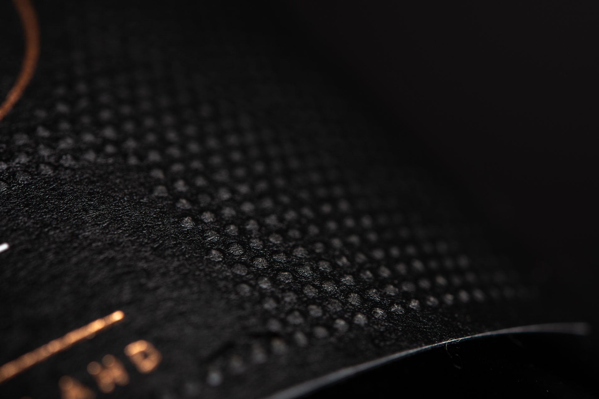
Touch is one of the most powerful senses of the body, and in packaging, helps to add sensory tactile depth. Consumers interact with the physical feel of packaging whether consciously or subconsciously, using it to weigh up the value of the product in their hands.
The use of different material finishes can appeal to the senses beyond what visuals can offer alone. Tactile cues can be an effective way to boost the overall value perception with surprisingly simple application. Great examples include the use of spot high gloss coatings or embossing, which can create a smooth, luxurious sheen on packaging and labels.
Matt or gloss varnish, soft-touch and textured finishes are a great way to instantly elevate packaging or labels and strengthen the value proposition.
In summary, while a clear understanding of target demographic is preferred, sometimes brands and packaging designers need to design for a much less well-defined audience. In these instances, there are certain ‘across the board’ factors that can combine to create packaging and labels that look outstanding on-shelf.
Whichever approach is taken, quality, consistency and innovation remain key. For printers aiming to deliver flexographic excellence no matter the brief or project complexity, why leave it to chance? Discover the terrific benefits of a dedicated repro partner and find out more about the value Creation, and its team of pre-press experts, can provide.
Creation specialises in turning great on-screen design into outstanding on-shelf appeal, perfectly positioned to help printers and brands harness their prepress operations as a competitive edge. Click here to discover more.